Check Out The List Of Colors You Should Avoid Painting Your Home With (3 of 3)
Advertisement
Avoid purple paint in your bedroom
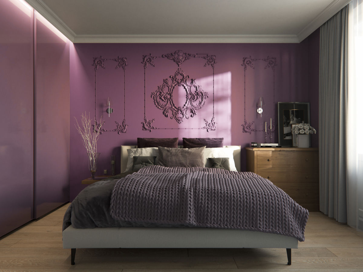
Unless you wish to wake all night, you should strictly avoid painting your bedroom in purple color. According to a 2013 survey conducted by Travelodge, purple turned out to be the worst color that allowed for a good night’s sleep – and it induced nightmares. The survey also made note of the fact that those having purple walls in their bedrooms only managed to get an average of around 6 hours of sleep a night.
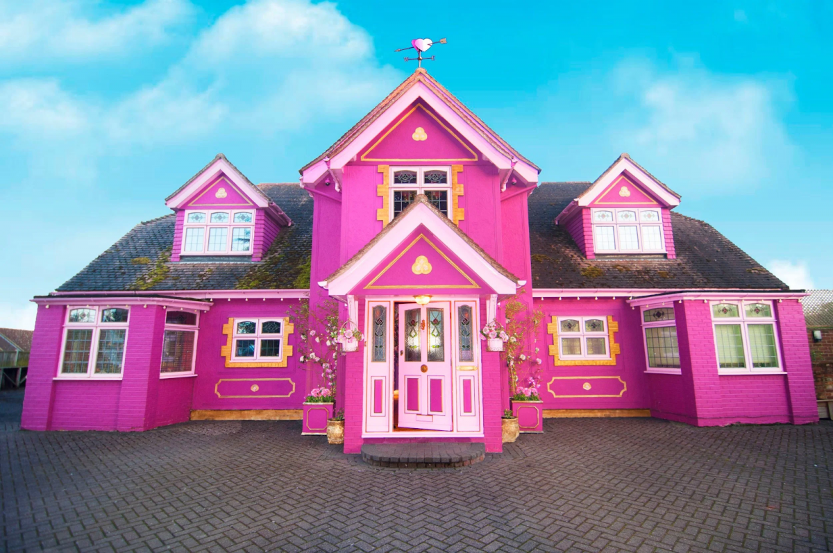
Say no to yellow on the exterior walls

According to Krishnan Archana, who is a home improvement expert, just by painting the exterior of your house yellow, you’re basically undoing all the nice designs and colors you’ve picked for the indoors. And this is backed by data. According to a 2018 Zillow study, painting the exterior of a house yellow reduced the real estate value of the house by a huge 3000 dollars!
Use pink but in moderation
Experts suggest that painting the accent walls in color pink words fine, but if you’re planning to paint an entire room pink, think again. According to CEO of T0 Do-Done, Tonya Bruin, pink is a color that takes over everything else.
She adds that irrespective of whether is a washroom, living room or kitchen if it is painted pink then you won’t be able to notice anything except the fact that it is pink. And that is exactly opposite to what anyone would want while painting their home. The idea of painting is to make sure it blends in with room’s aesthetic and stays in the background. Pink simply fails at doing that, and so, should be avoided at all costs.
Avoid using a mix of green and brown in any room
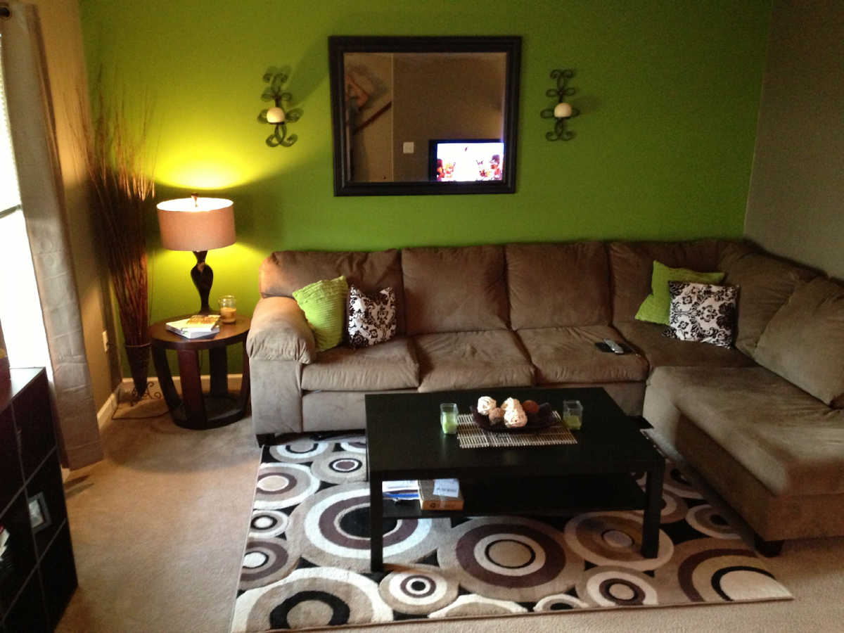
Home design expert Sam Whittaker warns against using opaque couché, or the color blend, as it very much looks and feels like bile. He adds that it is perhaps the worst color anyone can think of, for painting their home.
In fact, the color is disliked so much that in 2012, an Australian advisory team used the color blend on cigarette packets, and found out after months of research that the color didn’t exactly induce people into buying those cigarette packs. So, if you want people to stay away from your home, opaque couché should be the color of your house. If not, then you should strictly avoid it.